London Doorways as Motif Inspiration: A Visual Field Guide
A doorway is the most deliberate thing on a London street. Everything else along a terrace repeats: the same windows, the same brick, the same stucco. The door is where somebody chose. Walk twenty minutes of residential road in Islington, Camberwell or Notting Hill and you pass a few hundred of those choices — fanlights, tile surrounds, brass knockers, painted panels. As a source of colour and motif ideas, it is the best free reference library in the city.
Why London's doorways repay a second look
Most British towns have one dominant period of housing. London has nearly all of them, often within sight of each other: Georgian brick with a fanlight above the door, Victorian stucco with a portico, Edwardian red brick with a half-glazed door and a scrap of coloured glass, and 1930s suburbia with a tiled step and a leaded pane. Because the city grew street by street rather than in one campaign, the contrasts are abrupt. A walk down a single road can move you from black-and-buff tilework to pastel joinery in a hundred paces.
That variety is the point. You are not looking for one perfect door; you are collecting shapes, proportions and colour combinations that can be lifted out of their setting and used somewhere else entirely — on a floor, a textile, a graphic, a border.
Fanlights: geometry in a semicircle
The Georgian fanlight is the most useful thing on the whole facade, because it is pure pattern. Set above the door, filled with slender glazing bars, it exists to bring light into a hall and to give the entrance a bit of dignity. The result is a small, highly disciplined arrangement of arcs and lines that translates easily into repeat motifs.
Look at how the bars are drawn. A radial or sunburst pattern gives you wedge shapes, which is essentially a ready-made repeat for a rug, a quilt layout or a tiled floor. An interlaced or Adam-style design — ovals, ribbons, delicate arcs — gives continuous lines that suit a wallpaper border or an embroidered edge. Simpler fanlights use a few concentric bands and a half-moon, and those are the easiest to scale up without the design turning fussy.
Motifs worth photographing
- Wedge and segment shapes from radial fanlights
- Interlacing arcs and ovals from more elaborate designs
- Rectangular overdoor lights, often with a border of small squares
- Cast-stone keystones — shells, masks, husks and scrolls
- Carved brackets under the doorcase cornice, usually with a leaf or scroll
- Slender glazing bars: the line weight itself is a design decision worth copying
Victorian tile surrounds: pattern in miniature
Where the Georgians used light, the Victorians used colour. The tiled door surround — narrow panels of geometric tiles each side of the door, sometimes continuing across the reveal — is a miniature pattern book in perhaps half a square metre. Black, buff, white, brown and terracotta are the usual mix, with occasional blue or green.
What makes these surrounds so useful is that the pattern is already reduced. Nothing is loose or painterly; it is chequerboard, Greek key, rope twist, stylised flower, repeated on a small grid. That reduction is exactly what a motif needs if it is going to work at a different scale. Trace the repeat onto squared paper before you decide anything. Most of these patterns resolve into a simple grid of four by four or six by six, and once you know the grid you can enlarge it for a kitchen splashback or a bathroom floor without losing the character.
Door colours, and how to read them
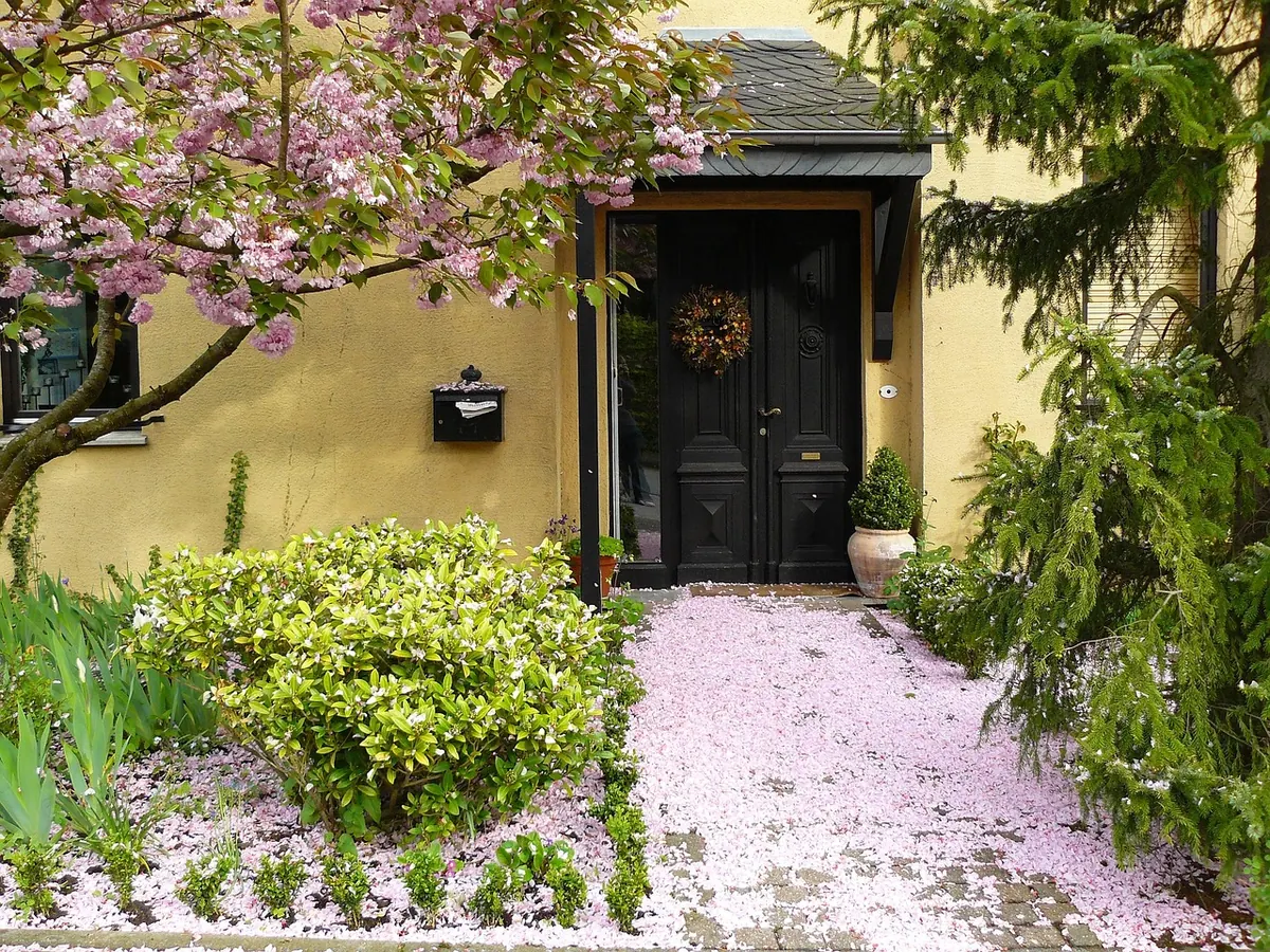
London door colours tend to fall into a recognisable family: deep teal, olive, ochre, cobalt, pillarbox red, charcoal, and the two constants, glossy black and off-white. On a stucco terrace the door often does all the colour work against pale cream walls, so the paint is unusually saturated. On brick, where the wall already carries texture, the door is usually calmer.
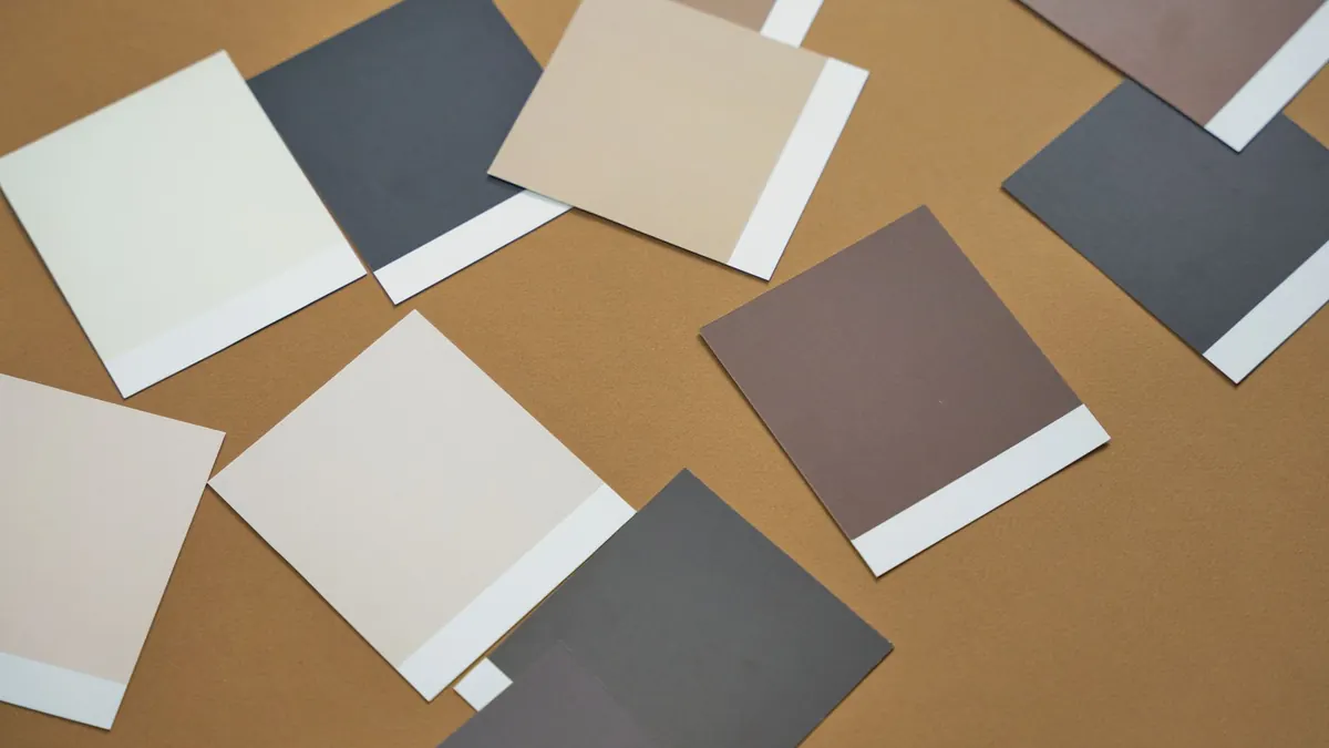
Two practical notes. First, gloss or eggshell reads much darker and richer than the same colour in a matt finish, so a shade that looks right on a door may look flat on a wall. Second, the light matters more than the sample card. Test a patch, leave it for a few days, and look at it in the morning and again in the evening; London's grey light can turn a warm ochre olive by four o'clock.
Door furniture and the small details
Then come the details, and this is where the smallest motifs live. Brass centre knobs and letter plates, ring and lion-head knockers, scalloped or diamond keyhole plates, boot scrapers, iron railings ending in spearheads or urns, the occasional painted number plate. None of these are large, but they are confident, well-drawn shapes — the sort of thing that works beautifully as a repeated motif on tile, fabric or joinery hardware.
Build a motif board from a single walk
You do not need a project to start collecting. Pick one street and give it an hour.
- Choose a stretch of about half a mile with mixed housing, so the periods change as you go.
- Photograph each door straight on, standing back far enough to include the fanlight and the tiles in one frame. Resist the urge to tilt upwards; a squared-up image is far easier to trace from later.
- Note the address and a word or two about the palette. Memory is unreliable on colour.
- Shoot the tile surrounds close up, in side light, so the glaze and grout lines are legible.
- Keep the set to five or six images. A long list of forty doors is a folder; five is a design direction.
- At home, crop each image to the pure pattern, then redraw the shape on squared paper at a small scale.
- Pair each motif with a palette drawn from the same door. The pairing is usually truer than anything invented at a desk.
Stay on the public pavement, keep people out of the frame, and do not photograph through windows or into hallways. A doorway is somebody's front door, not a film set.
Bringing doorway motifs indoors
The simplest translations work best. A fanlight wedge becomes a floor tile layout or a rug repeat. A tile surround border becomes a kitchen splashback or the edge of a tabletop. A door colour becomes the trim on a cupboard, the frame around a mirror, the one saturated note in a pale room.
Watch the scale. A fanlight a metre wide is a bold motif; reduce it and it becomes a delicate border detail — which is often the more useful version in an interior. Where possible, borrow shape and proportion rather than copying a whole composition; a knocker silhouette used as a small repeated motif on a cushion will read better than an identical knocker applied to a cupboard door.
One last thing. If you live in a listed building or a conservation area, changing an external door, fanlight or tiled surround may need consent, and the original is usually worth keeping. Check with your local planning authority before you alter anything outside the front door; the pattern is easier to borrow than to replace.
Photo: cocoparisienne / Pixabay