How to Build a Cohesive Colour Palette for Motif Designs
A motif collection stands or falls on repetition. The same leaf, scallop or geometric tile, redrawn at different scales and used across a cushion, a repeat pattern and a set of greetings cards. What makes those pieces read as one family, rather than a folder of unrelated drawings, is almost always colour.
Building a palette that does that job is less about taste than structure. You need a small set of colours with clear roles, rules for how they combine, and a reliable way of checking the whole thing holds together when the motifs change.
Begin with the motif, not the mood board
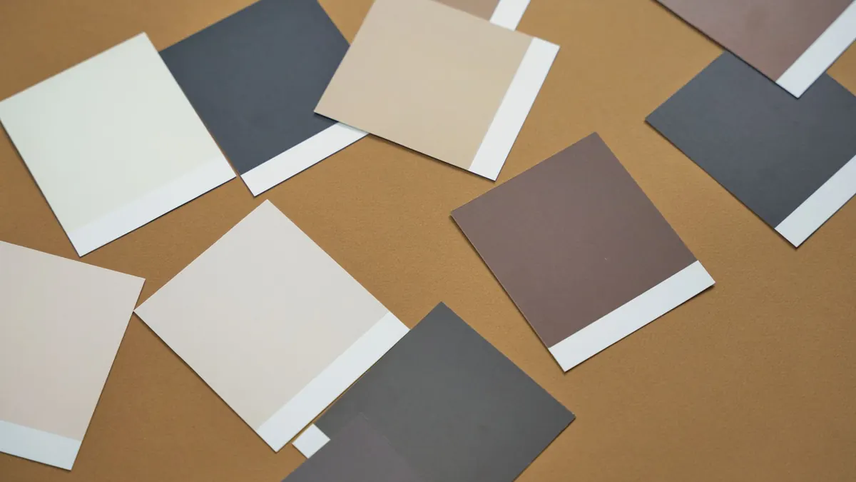
Palettes assembled in isolation tend to fall apart the moment they meet real artwork. Start instead with the motif you are happiest with, and sample its colours directly. If it already uses three shades that sit well together, those three are your first candidates. Pull them out as flat swatches — no gradients, no texture, no paper grain — so you can see them honestly rather than as part of a nice-looking drawing.
Then ask a blunt question: if this motif could keep only one colour, which would it be? That is your anchor. Everything else has to earn its place around it. Write the anchor down before you start browsing inspiration, because the temptation to drift towards whatever is fashionable this season is strong, and drift is how collections lose their thread.
Give every colour a job
Palettes usually fail because the colours compete rather than because any single one is wrong. Assign four roles, and keep the total to four to six colours:
- Anchor — appears in every motif, in some quantity. This is the signature colour.
- Secondary — supports the anchor. Appears often, but not always.
- Accent — used in small amounts. Usually the brightest or most saturated colour you own.
- Ground — the background or neutral. Paper white, ink black, a soft mid-tone, or a warm off-white.
If you find yourself needing more variety, resist adding a seventh hue. Change proportion and placement instead. A collection with five well-behaved colours will look richer than one with nine arguing ones.
Set proportions before you refine shades
Rough ratios stop a palette from turning into an even spread where everything shouts at the same volume. A workable starting point is 60 per cent ground, 30 per cent anchor and secondary, 10 per cent accent. That accent will feel far more powerful at 10 per cent than it does at 25, and you will be less tempted to pick an aggressive colour to compensate.
Try writing the ratio next to your swatches. It is a small thing, but it turns a nice set of colours into something you can actually apply consistently across a hundred variations.
Check value, not just hue
Hue is the colour itself; value is how light or dark it is. Convert your swatches to greyscale — a photocopy, a phone filter, whatever is quickest. If two colours collapse into the same grey, they will blur together at small scale: on a repeating fabric, on a label, on a phone screen in daylight.
Fix it by swapping one for a lighter or darker version of itself, not by changing the colour family. You can keep the palette's character while making the shapes inside each motif legible.
Write rules for how colours meet
Individual colours rarely cause trouble. Adjacent colours do. Decide which pairings are allowed before you draw anything else.
Lay the palette out in a grid where every colour touches every other colour. Mark the pairings that look muddy, vibrating or simply dull, and rule them out. Common rules that work well: outline everything in the darkest neutral; never let the accent touch the ground directly without the anchor between them; keep two mid-tones apart, because they flatten each other. These rules become the grammar of your collection — and they save hours of fiddling later.
Carry the palette across a collection
Consistency does not mean repeating the same artwork. Vary these three things and the family resemblance survives:
- Proportion. A motif that is mostly anchor in one design can be mostly ground in another, with the anchor reduced to an outline.
- Role swapping. Let the secondary colour take the accent's place in one hero motif, so long as the anchor still appears somewhere.
- Tints and shades. Add white or a touch of dark to an existing colour rather than introducing a new hue. This gives you depth without breaking the set.
Keep at least one constant across every motif. Often it is the outline colour or the ground. That constant is what the eye latches onto when the shapes change.
Test the palette where it will actually be seen
Print it small. A palette that sings at A3 can turn to mush at 30mm, which is roughly the size of a small repeat or a swing tag. View it in daylight, then in the flat light of a north-facing room, then on a screen.
Screens push saturation, so a colour that looks calm in print may look electric on a phone. Textiles soften and darken tones compared with paper, so if your motifs are heading for fabric, check a proof before committing. And check every combination, not just the ones you like. The muddy pairing will be the one someone else uses first.
Write the palette down
A one-page spec sheet keeps a collection coherent for months, and lets anyone working with you stay on track. Include:
- Each colour with a descriptive name and a reference number — "Clay", "Ink", "Chalk", not "blue 2".
- Its role, and the proportion it should occupy.
- Allowed and forbidden pairings.
- One line on what to do when a new colour feels necessary.
Naming matters more than it sounds. A name carries intent; a number just carries data. It also makes conversation easier when you are briefing a printer or a collaborator.
Putting it to work
Start with three motifs, not thirty. Build the palette, test the pairings, check the values in greyscale, then add a fourth and a fifth. If a new motif demands a new colour, pause and ask whether the motif is the problem or the palette is. Usually it is the motif, and a small redraw solves it faster than a full palette rebuild.
Keep a physical swatch card on your desk or pinned above it. Refer to it before every new drawing, not after. And when you do eventually revise the palette, revise it deliberately — update the spec sheet, recheck the pairings, and reprint one test sheet. A collection is built out of small consistent decisions, and colour is the one that ties all the others together.
Photo: cottonbro studio / Pexels